
Eastgate is a church based in Kent. A new website that was contemporary, easy to use and inviting was needed, which led to exploring a complete brand refresh.


In the new logo, the weight of each letter decreases from left to right to replicate the effect of the gates fading out in the old logo.
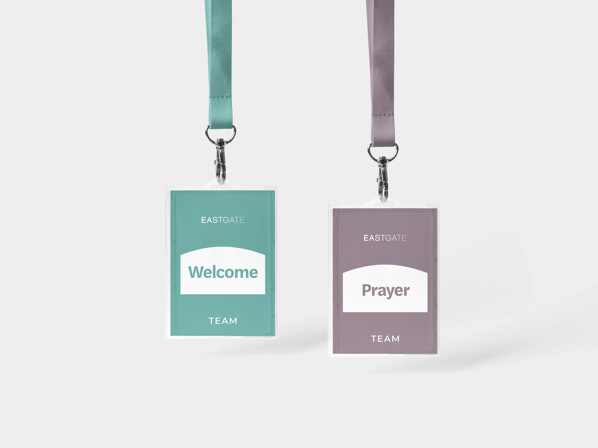
Inspired by the church building, this shape forms the foundation of the design system. It can frame photography, be filled with colour, layered with text, and more.


Something else to consider was the introduction of Eastgate Plus as the new home for video, audio and written content.
